The Linked N
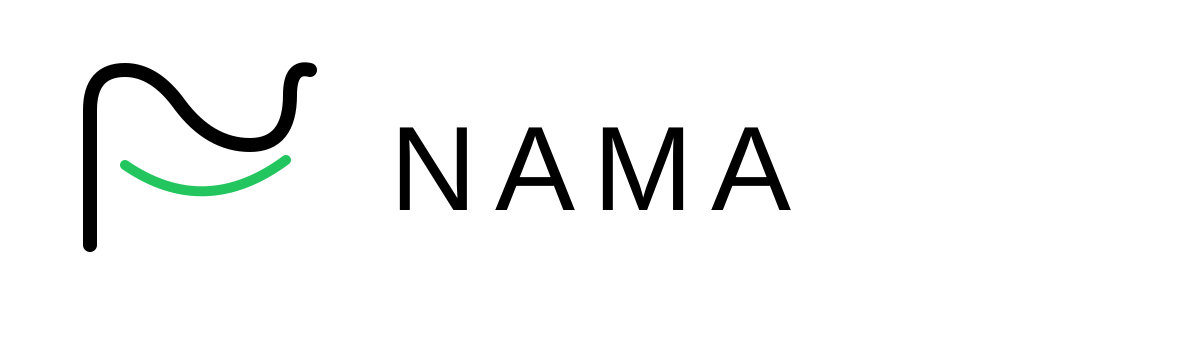
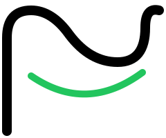
Two rounded loops interlock to draw an N for NAMA. The strokes are heavy and even, so the mark stays clear from a 16px favicon to a full-size banner.
The NAMA symbol is a minimalist expression of intelligence, travel, and customer delight.
Two rounded loops interlock to draw an N for NAMA. The strokes are heavy and even, so the mark stays clear from a 16px favicon to a full-size banner.
Each loop reaches into the other. It stands for what NAMA does every day: linking agencies, suppliers and travellers into one working system.
The mark sits on a NAMA-green (#22C55E) rounded square, so it reads as one confident icon on any screen, light or dark.
NAMA is a smart, friendly intelligence working quietly inside your travel business, guiding every journey and creating happier customers.
Ink
#111827
Primary text
Green
#22C55E
Accent + the logo square
Slate
#0F172A
Darker brand text (headings, CTAs)
Cloud
#F8FAFC
Surface backgrounds
Lavender
#F4F5FB
Page background (light mode)
On light surfaces · primary
On dark surfaces · inverted
All NAMA brand assets in one place. Please follow the brand guidelines (PDF) when using these.
Questions about brand usage? brand@getnama.app
Press & partnerships: hello@getnama.app